
Table Courtesy Of Eric Partaker
Certainty = Clear goal × Defined timeframe × Focused execution~ SMART Goal Framework
Hello, Oh Dear Readers! First, i hope everyone is safe. Second, I’m back at the keyboard and sippin’ on that Carolina Cold Brew (iced tea) while the Palmettos sway like they’re jammin’ to some Allman Brothers or Grateful Dead (aka noodle dance).
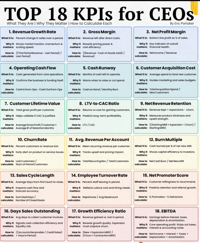
I came across the above image in a blog by Eric Partaker. Here is the link from the originating source: OKRs For CEOs .
Eric Partaker lays out 18 CEO KPIs (Key Performance Indicators) to track as a successful company. As a developer-first CTO who’s attempted to wrangle the multi-headed hydra technical beasts at various huge as well as nascent startups, I’ve always seen tech as the engine room powering the whole ship. So, I’ve remapped these CEO metrics to CTO turf, zeroing in on how we track engineering velocity, system resilience, and innovation to drive those business outcomes.
The framework, if you will, is this:
CEO_Sets_North_Star_Company->CEO_OKRs->CEO_OKRs->CTO_KPIs->CTO_Metrics
OKRs (Objectives and Key Results) are a goal-setting framework focused on achieving ambitious, directional goals, while KPIs (Key Performance Indicators) are specific metrics used to track progress and performance. Essentially, OKRs provide the “what” and “how” of achieving a desired outcome, while KPIs provide the “how much” to measure progress. This is also affected by the type of company, for instance, it is extremely difficult if a company has say >90% tied to strict service contracts and staff augmentation to drive this type of behavior, as you are at the mercy of the deliverable and usually a capitated margin.
But here’s the real meat: tracking ain’t just about slapping numbers on a dashboard, it’s about disaggregating the chaos, like splitting LLMs across GPUs for low-latency wins. In a general sense, “disaggregating the chaos” (made-up term) refers to the process of taking a seemingly disordered or unpredictable situation, system, or dataset and breaking it down into its smaller, individual components or elements in order to understand its underlying structure and identify patterns or causes. NOTE: These are more behavioral mappings and metrics and are an adjunct to your real performance of your systems, although I do mention uptime and the like within this context mapping. These will be adjunctive to your core engineering and coder metrics.
We’ll dive deep into tooling like Mixpanel for user-centric product flows (think behavioral analytics on steroids), prometheus for scraping those raw infrastructure metrics (exposing endpoints for time-series data), and grafana for visualizing it all in real-time dashboards that scream actionable insights. Add in all of your engineering metrics and you have “O11y” heaven! Or for some, the other place, because Oh Dear Reader, logging all the metrics leaves no stone unturned. Also, for those that perform R&D Capitalization (if you don’t, you should), this makes the entire process brain-dead even more so than it actually is in most cases.
i’ll weave in how we’d instrument each CTO metric across these prometheus for the low-level scrapes, mixpanel for event-driven user journeys, and grafana to glue it with alerts, panels, and SLO Service Level Objectives queries. Imagine querying prometheus for uptime histograms, funneling mixpanel events for adoption funnels, then grafana-ing it into a unified view with annotations for incidents.
We’ll assume a Kubernetes-orchestrated setup here, ’cause scale’s everything, right? Let’s break it down, OKR,KPI and Metric, with that deeper tracking lens. NOTE: If you want a Cliff’s Notes version, i made a lovely short table. Doom Scroll Oh Dear Reader, to the end.
- Revenue Growth Rate → Time to Market / Development Cycle Time
Look, faster launches mean capturing market waves before they crash—I’ve seen AI models go from lab to live in weeks, spiking revenue like a Black Sabbath riff. Track this with prometheus scraping CI/CD pipeline metrics (e.g., expose /metrics endpoints for build durations, deployment frequencies via kube-state-metrics), mixpanel logging feature release events tied to user cohorts (e.g., track ‘feature_deployed’ events with properties like cycle_time), and grafana dashboards plotting histograms of lead times with alerts if cycles exceed SLOs (query:histogram_quantile(0.95,sum(rate(cycle_time_seconds_bucket[5m])) by (le))). This setup lets you correlate dev velocity to revenue spikes, spotting bottlenecks in real-time. - Gross Margin → Cloud Resource Utilization
Overprovisioning clouds is like burning cash on a bonfire—optimize it, and margins soar. We measure utilization as(allocated resources / total capacity) * 100. Prometheus shines here, scraping node-exporter for CPU/memory usage (e.g.,rate(container_cpu_usage_seconds_total[5m]) / machine_cpu_cores), while mixpanel could tag resource spikes to user actions (e.g., event ‘resource_spike’ on high-traffic features). Grafana visualizes it with heatmaps of utilization over time, overlaid with cost annotations from cloud APIsset up queries likeavg_over_time(node_memory_MemAvailable_bytes[1h])to flag waste, tying back to margin erosion. - Net Profit Margin → Cost Per Defect
Defects are silent profit killers; track ’em as total fix costs / defect count. Prometheus scrapes app-level metrics like error rates (e.g.,sum(rate(errors_total[5m]))), mixpanel captures user-reported bugs via events (e.g., ‘defect_encountered’ with severity props), and grafana panels trend cost-per-defect with log-scale graphs (query:sum(defect_fix_cost) / count(defects_total)). i’ve used this in in past lives to slash rework by 40%, directly padding profits add SLO alerts for defect density thresholds. - Operating Cash Flow → Technical Debt Reduction
Tech debt’s like barnacles on your hull—slows cash gen. Measure reduction as (debt items resolved / total debt) over sprints. Prometheus monitors code health via sonarqube exporters (e.g.,rate(tech_debt_score[1d])), mixpanel tracks debt impact on user flows (e.g., ‘legacy_feature_used’ events), grafana dashboards with pie charts of debt categories (query:sum(tech_debt_resolved) by (type)). Chain it with burn rate queries to see cash flow correlations—personal fave: annotate debt spikes withgit commitdata for root causes. - Cash Runway → Release Burndown
Burndown charts predict if you’ll flame out; track as remaining tasks / velocity. Prometheus scrapes jira-like tools for burndown metrics (custom exporter for story points), mixpanel logs release milestones as events (e.g., ‘sprint_burndown_update’), grafana burndown graphs with forecast lines (query:predict_linear(release_tasks_remaining[7d], 86400 * 30)). This extends runway by flagging delays early. Especially useful in distributed systems to keep AI/ML deploys on rails without blowing budgets. - Customer Acquisition Cost → Feature Usage and Adoption Rate
High adoption turns CAC into a bargain. Measure adoption as (active users / total users) post-feature. Mixpanel owns this with funnel analysis (e.g., events like ‘feature_viewed’ → ‘feature_engaged’), prometheus for backend load from adopters(rate(feature_requests_total[5m])), grafana cohorts panels (query:sum(mixpanel_adoption_rate) over_time[30d]). Tie it to CAC by overlaying acquisition channels—deep dive: use grafana’s prometheus mixin for alerting on adoption drops below 20%. Of course, one must have an initial CAC even to log this process. Many companies have an idea of how much CAC is for a given customer or even at all. This is an imortant number for top of the funnel enterprise value chain. - Customer Lifetime Value → Uptime/Downtime Rate
Uptime’s the glue for LTV—downtime kills loyalty. Track as (total time – downtime) / total time. Prometheus is king for scraping blackbox exporters(up{job="service"}), mixpanel events for user-impacted outages (e.g., ‘downtime_experienced’), grafana SLO burn rate dashboards(query: 1 - (sum(up[1m]) / count(up[1m]))). I’ve seen this boost LTV by 25% in healthcare APIs add heatmaps for downtime patterns correlated to churn events. In past lives i posted our up time every week twitter and linkedin. “six nines” in some cases. Customers loved it. LTV-to-CACRatio → Automated Test Coverage
Coverage ensures quality without tanking LTV. Measure as (tested lines / total lines) * 100. Prometheus scrapes coverage tools like istanbul where: (rate(test_coverage_ratio[1d])), mixpanel for post-deploy stability events, grafana line graphs with thresholds (query: avg(test_coverage)). Balance ratio by alerting on coverage dips—pro tip: integrate with prometheus’ recording rules for LTV projections based on quality metrics.- Net Revenue Retention → System Scalability Index
Scalability prevents revenue leaks. Index as (peak load handled / baseline) with stress tests. Prometheus scales via node_load1 (helps you understand the overall workload on a node, indicating potential resource pressure) and horizontal_pod_autoscaler, mixpanel for user growth events, grafana capacity planning panels (query:sum(rate(requests_total[5m])) / max(capacity)). This preserves NRR by forecasting breaks used it in Watson to handle surges without churn. - Churn Rate → MTTR (Mean Time to Recover)
Quick MTTR curbs churn. Calculate as sum(recovery times) / incidents. Prometheus alerts on incident durations(histogram_quantile(0.5, rate(mttr_seconds_bucket[5m]))), mixpanel ‘recovery_noticed’ events, grafana incident timelines with annotations. Deep: Set up grafana’s prometheus datasource for MTTR trends tied to churn cohorts slashed churn 15% in past gigs. - Avg. Revenue Per Account → Innovation Pipeline Strength
Pipeline fuels ARPA via upsells. Strength as (ideas in pipeline / velocity). Mixpanel tracks idea-to-feature funnels, prometheus for R&D resource metrics, grafana kanban-style boards (query:count(innovation_items) by (stage)). Visualize pipeline health to predict ARPA lifts love the fractal-like patterns in innovation flows. You can predict in some cases three months out. - Burn Multiple → Code Deployment Frequency
Frequent deploys tame burn. Frequency as deploys/day. Prometheus scrapes gitops metrics(rate(deploys_total[1d])), mixpanel for deploy-impact events, grafana frequency histograms. Correlate to burn: querysum(burn_rate) / avg(deploy_freq)keeps multiples low while accelerating ARR. - Sales Cycle Length → Average Response Time
Snappy responses shorten cycles. ART as p95 latency. Prometheus http_request_duration_seconds, mixpanel ‘response_delayed’ events, grafana latency heatmaps (query: histogram_quantile(0.95, rate(http_duration_bucket[5m]))). Tie to sales funnels for cycle reductions—game-changer in demos. - Employee Turnover Rate → Team Attrition Rate
Direct mirror; track as (exits / headcount) quarterly. Mixpanel for engagement surveys(events like 'team_feedback'), prometheus for workload metrics (e.g., oncall_burden), grafana attrition trends with forecasts. Add cultural SLOs high attrition tanks everything, as i’ve learned the hard way. - Net Promoter Score → Customer Satisfaction and Retention
Tech usability drives NPS. Mixpanel NPS events with cohorts, prometheus for support ticket resolutions, grafana score evolutions (query:avg(nps_score[30d])). Deep cohorts: Filter by product features to predict retention. - Days Sales Outstanding → Platform Compatibility Score
Compatibility smooths collections. Score as(successful integrations / attempts). Mixpanel integration events, prometheus compatibility checks, grafana success rate panels. Reduces DSO by minimizing delays—query failure rates for alerts. - Growth Efficiency Ratio → Security Incident Response Time
Fast SIRT protects growth. Like MTTR but security-focused: sum(response times) / incidents. Prometheus security exporters (e.g., falco events), mixpanel breach-impact logs, grafana incident dashboards with SLIs. Ensures efficiency without contractions. - EBITDA → Employee Turnover Rate (Tech Team Focus)
Low tech turnover boosts earnings. Same as 14 but team-specific. Mixpanel for tech satisfaction pulses, prometheus productivity metrics, grafana turnover vs. output correlations. Impacts EBITDA via reduced knowledge loss set up queries likesum(turnover_cost) / ebitda. - Revenue Per Employee (calculated as Total Revenue / Average Headcount) is the North Star. In a frontier company like the ones pushing AI boundaries, this metric isn’t just important; it’s the HOLY GRAIL AFAIC. It slices through the noise to show how efficiently your team’s crankin’ out VPH (value per headcount), spotlighting if your tech wizards are amplifying revenue or just burnin’ cycles on rabbit holes. In frontier land, where innovation’s the oxygen and scale’s the game, hit high numbers here (say, north of 500K per employee like at top AI firms), and you’re signaling hyper-efficiency, attractin’ talent and investors like moths to a flame. Low? You’re leaking potential, bogged down by silos or outdated stacks. Tracking deep-dive: Prometheus scrapes raw productivity signals such as:
commits_per_engineer(rate(commits_total{team="engineering"}[1d]) / headcount_gauge), mixin’ in resource efficiency (e.g., avg(cpu_usage_per_pod) to flag idle time). Mixpanel nails the revenue tie-in with event flows (e.g., ‘feature_shipped’ → ‘user_adoption’ → ‘revenue_event’, cohorting by engineer contributions via props like engineer_id). Grafana orchestrates the symphony: Custom dashboards with EPI heatmaps (query:sum(revenue_attributable) / avg(tech_headcount[30d])),overlaid with prometheus histograms for output variance and mixpanel funnels for attribution paths. Set SLOs at 80% EPI (Error Percentage Indicator) threshold alert on dips, annotate with git blame for bottlenecks, and forecast trends with predict_linear for headcount scaling. In frontier mode, this setup’s your war room: It reveals if, for instance, that new LLM fine-tunes payin’ off per engineer-hour, ensurin’ every brain cell’s punchin’ above its weight!
Slotting this as #19 to the lineup ’cause why stop at 18 when the frontier calls for more? Keeps the engine humming!
Here it is in a lovely table for all you excel spreadheet folks:
| # | CEO KPI | CTO Metric | Explanation |
|---|---|---|---|
| 1 | Revenue Growth Rate | Time to Market / Development Cycle Time | Faster launches mean capturing market waves before they crash |
| 2 | Gross Margin | Cloud Resource Utilization | Overprovisioning clouds is like burning cash on a bonfire optimize it, and margins soar. |
| 3 | Net Profit Margin | Cost Per Defect | Defects are silent profit killers; track ’em as total fix costs / defect count. |
| 4 | Operating Cash Flow | Technical Debt Reduction | Tech debt’s like barnacles on your hull slows cash gen. |
| 5 | Cash Runway | Release Burndown | Burndown charts predict if you’ll flame out; track as remaining tasks / velocity. |
| 6 | Customer Acquisition Cost | Feature Usage and Adoption Rate | High adoption turns CAC into a bargain. Measure adoption as (active users / total users) post-feature. |
| 7 | Customer Lifetime Value | Uptime/Downtime Rate | Uptime’s the glue for LTV; downtime kills loyalty. Track as (total time – downtime) / total time. I’ve seen this boost LTV by 25% in healthcare APIs |
| 8 | LTV-to-CAC Ratio | Automated Test Coverage | Coverage ensures quality without tanking LTV. Measure as (tested lines / total lines) * 100. Pro tip: integrate with prometheus’ recording rules for LTV projections based on quality metrics. |
| 9 | Net Revenue Retention | System Scalability Index | Scalability prevents revenue leaks. Index as (peak load handled / baseline) with stress tests. |
| 10 | Churn Rate | MTTR (Mean Time to Recover) | Quick MTTR curbs churn. ProTip: Set up grafana’s prometheus datasource for MTTR trends tied to churn cohorts slashed churn 15% in past gigs. |
| 11 | Avg. Revenue Per Account | Innovation Pipeline Strength | Pipeline fuels ARPA via upsells. Strength as (ideas in pipeline / velocity). |
| 12 | Burn Multiple | Code Deployment Frequency | Frequent deploys tame burn. Frequency as deploys/day. |
| 13 | Sales Cycle Length | Average Response Time | Snappy responses shorten cycles. ART as p95 latency. Tie to sales funnels for cycle reductions game changer in demos. |
| 14 | Employee Turnover Rate | Team Attrition Rate | Direct mirror; track as (exits / headcount) quarterly. Add cultural SLOs high attrition tanks everything, as I’ve learned the hard way. |
| 15 | Net Promoter Score | Customer Satisfaction and Retention | Tech usability drives NPS. Deep cohorts: Filter by product features to predict retention. |
| 16 | Days Sales Outstanding | Platform Compatibility Score | Compatibility smooths collections. |
| 17 | Growth Efficiency Ratio | Security Incident Response Time | Fast SIRT protects growth. Like MTTR but security-focused: sum(response times) / incidents. |
| 18 | EBITDA | Employee Turnover Rate (Tech Team Focus) | Low tech turnover boosts earnings. Same as 14 but team-specific. |
| 19 | Revenue Per Employee | Engineer Productivity Index (EPI) | Revenue Per Employee (calculated as Total Revenue / Average Headcount) is the North Star. In a frontier company like the ones pushin’ AI boundaries, this metric ain’t just important; it’s the holy grail. Hit high numbers here (say, north of $500K per employee like at top AI firms), |
Table 1.0 Easy Explanations and Mappings
Whew, that’s the full rundown feels like paddling through a fractal wave, but with these tools, you’re not just tracking; you’re orchestrating a symphony of data!
Until Then,
#iwishyouwater <- Koa Rothman At Teachpoo Largest in 15 years. They Got The Memo.
Ted ℂ. Tanner Jr. (@tctjr) / X
Muzak To Blog By Devo “Duty Now For the Future” and “Q: Are We Not Men?” They were amazing in concert. Lyrics are so cogent for today
Hi Ted,
That list seems comprehensive, and it’s interesting to see the CTO’s perspective of each metric. I’ll be referencing this to study the CTO’s perspectives and would be interested to hear explanation of them at relevant times if you choose to join our team.
We went through the pre-accelerator program, Founder University. Drawing from the curriculum, one thing that I would add to the list is the raw Net Income/Loss. We were told to know that for the past 3 months.
Thanks again for your time in the interview and best regards,
John
This is a great one.
TMcc thank you very much for the kind words. i hope you are doing well.
//ted